The default arrangement of buttons is intended for new users. When someone
starts the app for the first time we want them to see how to download maps and
how to get help straight away, so we put the
and buttons where they can’t be missed.
Once you’ve got the maps for the areas you visit and you’ve discovered documentation
such as this page, there are better uses for that valuable space at the bottom of
the screen. To achieve that, you can rearrange the buttons using the Buttons section
of the Settings screen.

The app can have up to seven “button bars”, and you can move the buttons
between them. Only three are used in the default arrangement. The button bars are:
- A pair of bars at the top of the screen (not used by default).
- A pair of bars in the pop-up that is shown when you select a point.
- A pair of bars at the bottom of the screen.
- One that is always hidden.
The pairs consist of a main bar and a more bar. A “more” button in the
main bar shows the more bar when it is tapped. If a button bar is empty, it’s
not shown; if a more button bar is empty, the corresponding more button is not
shown.
The default layout puts four buttons in the bottom main button bar. That
should almost always fit in a single row. The number of buttons that fit in a
row depends on what device you have, whether you are using “Zoomed” mode (on
larger-screened iPhones only), and what text size you have chosen in the main
Settings app. If there are too many buttons to fit in a single row, multiple
rows will be used.

To change the layout, open the Settings screen and scroll down to find the
Buttons section. To move buttons between button bars, drag them between the sections
of this list.
Note that you can’t drag the More buttons to different bars. Note also that
the bar headings are also dragable; sometimes it’s quicker to move the heading rather
than several buttons.
You can also change the size of the buttons; in the Settings screen you
can choose Large, Variable or Small button size. The default is large, and the
name of the button is shown below the icon. In small mode the name is not shown
and the icon is slightly smaller. In small mode you can fit about seven buttons
in each row. In variable mode, the app tries to make the “current” button bar large
and others small.


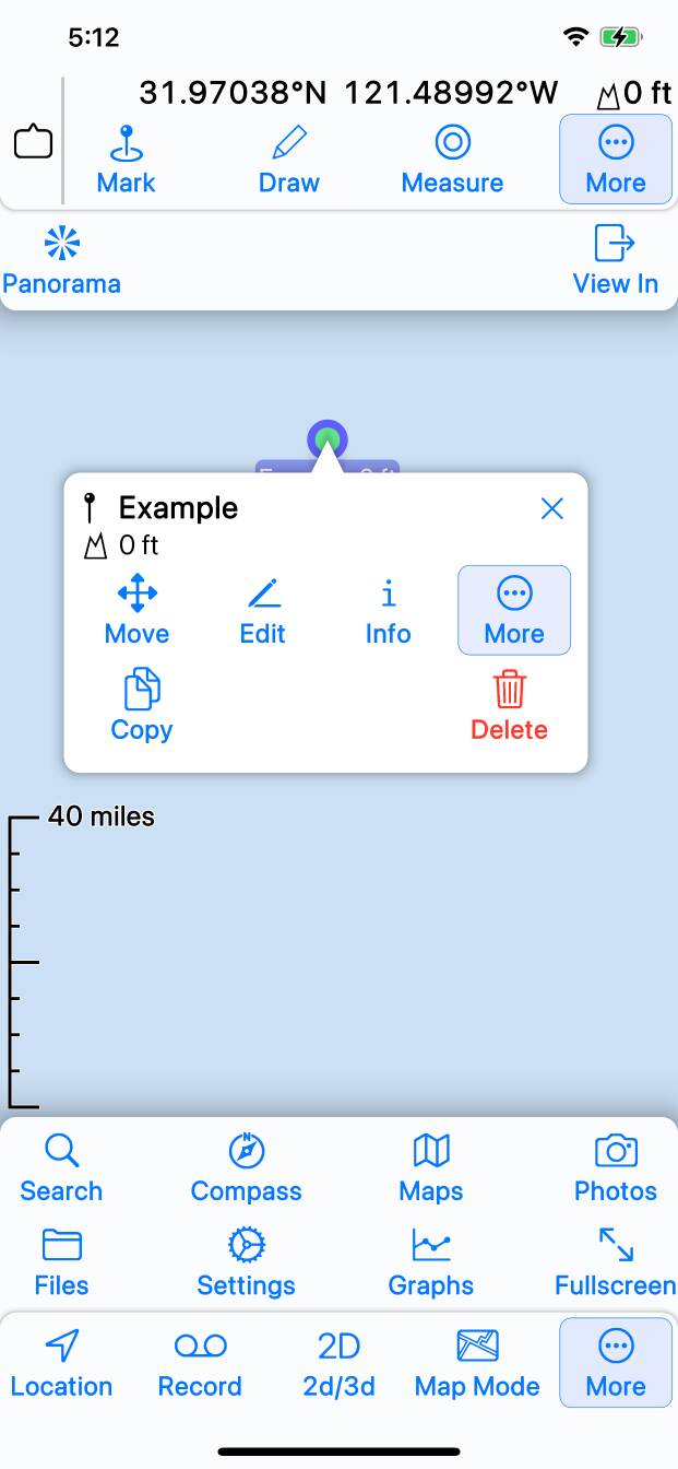
Here are some example button layouts. The first is the default layout;
as noted above this put the buttons that we want new users to find in the
prominent positions in the bottom button bar. The top button bar is not used.
All buttons related to the current selection or current position are in the
selection popup’s button bar.
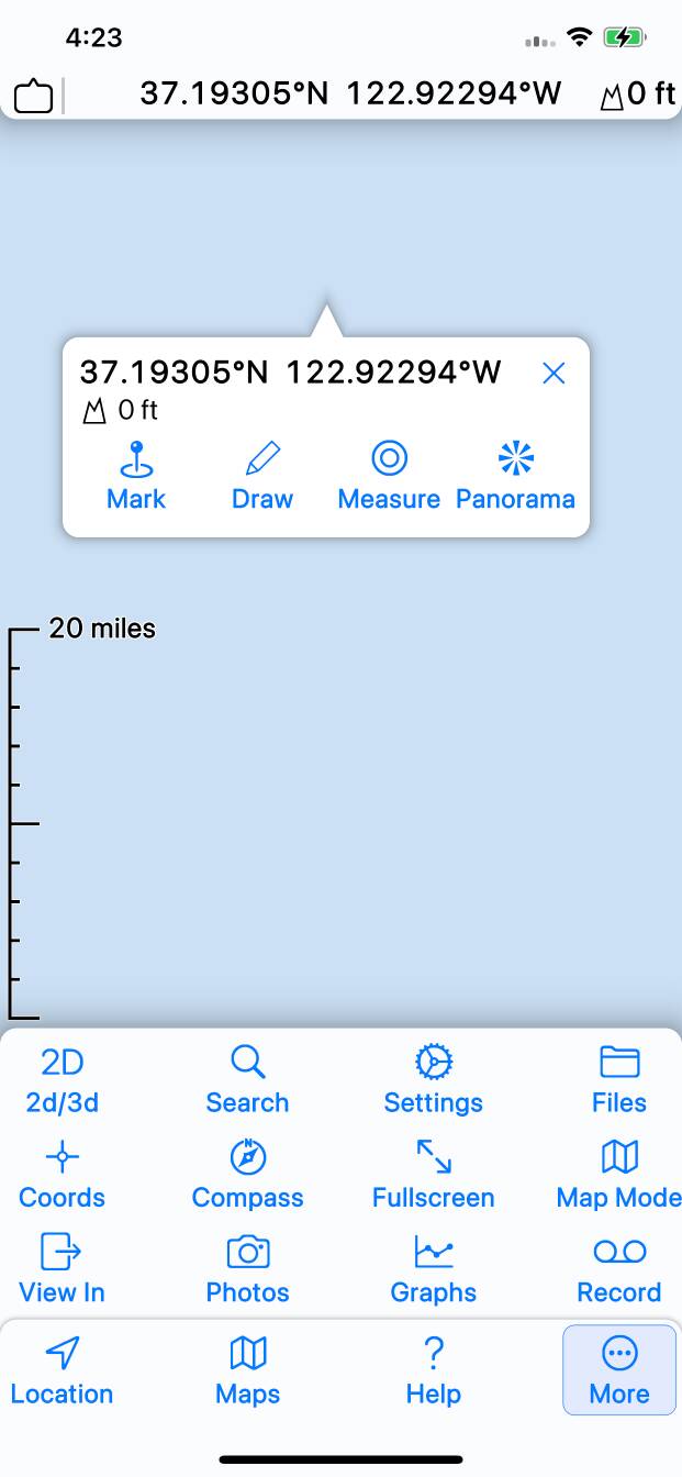
The second matches the original Topo Maps app as closely as possible, in
case there is anyone whose muscle-memory has accustomed them to that. Note that
this also shows the fullscreen crosshairs mode, which matches the original app.
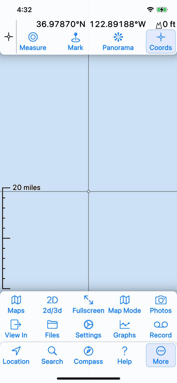
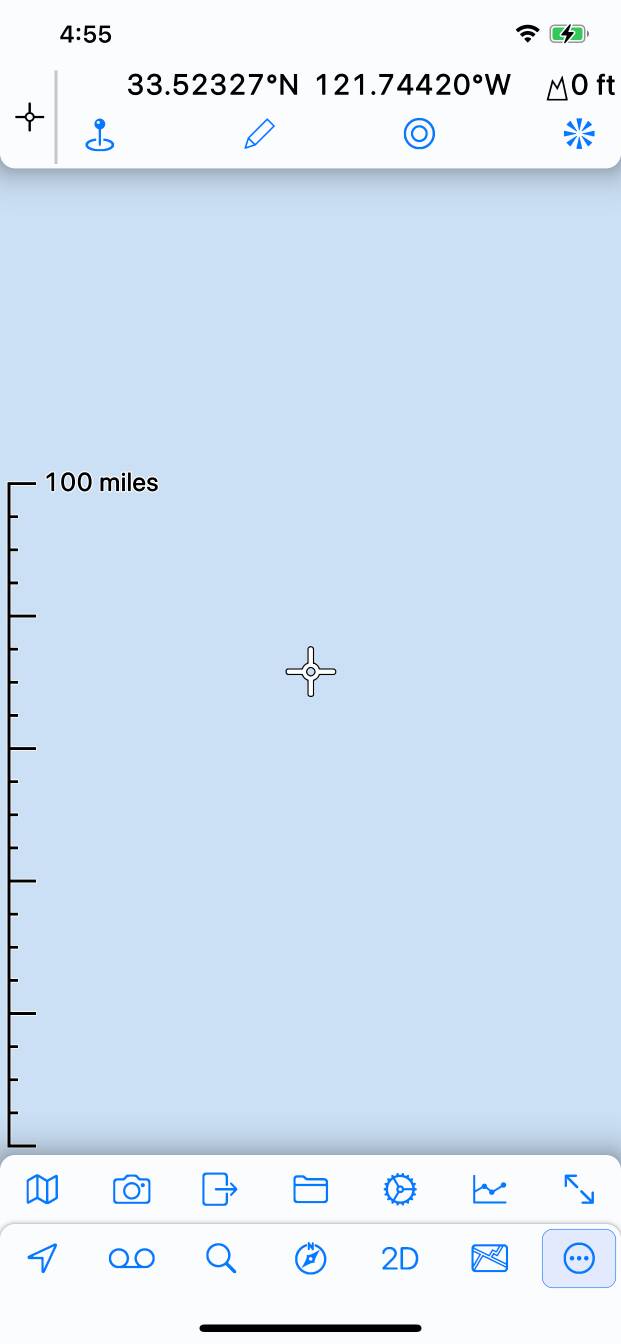
The third example uses small button mode, and fits seven buttons across
the width of the screen; that’s the maximum possible on that particular device.

